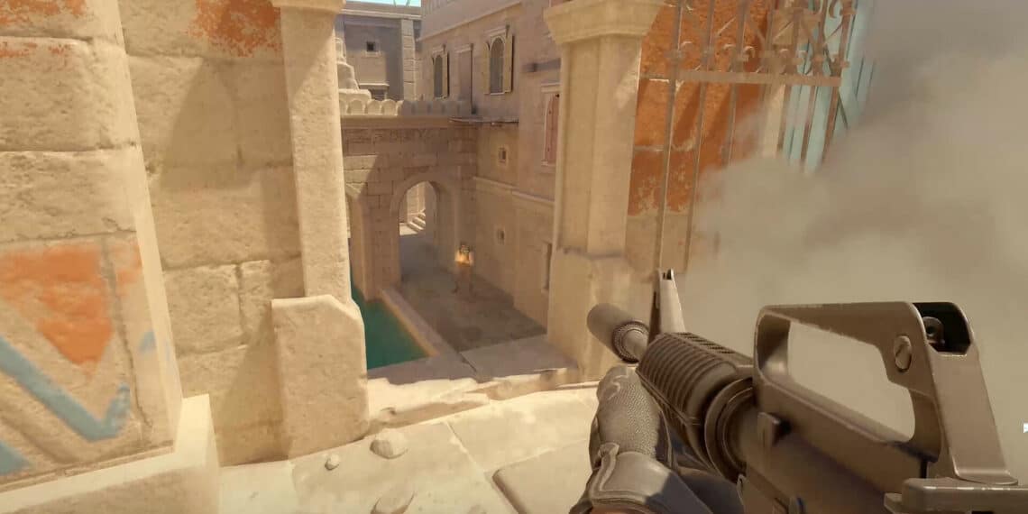
The Counter-Strike community is abuzz with viewpoints surrounding a recent submission on the popular game’s skin design: the GLOCK-18 | Layout. The skin is a new version created by Scropin, but opinions within the community are diverse.
Summary
- Counter-Strike’s GLOCK-18 | Layout skin design has received mixed feedback from the community. Some are in awe of its originality, while others see room for improvement.
- The skin’s in-game visual effect and color scheme is a point of contention. Several users believe that its current palette reduces the overall impact.
- One interesting perspective posed is that while the skin’s design is controversial, Scropin’s presentation skills have been appreciated by the community.
- It is clear that the skin’s flavor elicits polarizing views, which raises questions about the direction of future Counter-Strike skin designs. Will they sway towards the avant-garde or stick to traditional aesthetics?
The Community’s Reception
The overall design of the GLOCK-18 | Layout skin has received a warm welcome from several players. User n00bzilla called it ‘incredible‘, highlighting the fresh wave of innovation that the game is experiencing. Another user, Fr34k0o, shared that ‘this is the first skin from this sub that has looked really good to my eyes‘, adding another endorsement for the design.
Points of Contention
A budding debate in Counter-Strike’s player community surrounds the aesthetics of the recently released skin. User fkmeamaraight pointed out that although the ‘skin looks cool on the picture, …it looks absolutely terrible in the game‘. Echoing this sentiment was HypickleSkyblock’s statement that ‘the effect is lost somewhat in the game‘, expressing dissatisfaction with the visual translation of the skin from idea to in-game reality.
Potential Improvements
The community’s feedback also offered interesting perspectives on potential enhancements to the skin design. User M1dor1 opined that they ‘Would use brighter colours’, hinting towards the need to improve the skin’s vibrancy for a more substantial in-game impact. Another user, mini337, sought more details by inquiring, ‘Where’s the workshop link’, highlighting the need for a proper platform to appreciate and critique the design.
Every new skin design shakes up the Counter-Strike community. This recent initiative by Scropin has been no different. Although some appropriated the style and innovation of the GLOCK-18 | Layout, others expressed a desire for modifications and refinement. As the world of gaming skin designs continues to grow, it will be intriguing to observe the direction future designs take, catering to the varied tastes of gamers worldwide.


