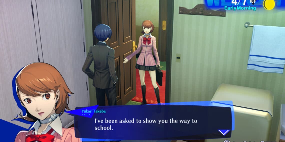
Have you ever tried to replicate a game UI for a presentation but ended up creating something beyond your expectations? That’s exactly what happened when a Redditor attempted to recreate Persona 3 Reload’s menu UI for an abpsych presentation.
Summary
- The Redditor not only replicated but elevated the UI, receiving applause from the community.
- Some users expressed interest in downloading the presentation materials.
- Feedback on readability was noted, with praise for the overall design.
- The choice of images and thematic elements resonated with fans.
Community Reception
When a Redditor shared their attempt at replicating Persona 3 Reload’s menu UI, the community was quick to praise the effort. Comments like, “Try is an understatement you did that junk 👏🏾👏🏾” and “‘tried’? more like ‘achieved’ this looks good!” reflected the positive sentiment towards the project.
Design Excellence
Despite the project’s success, some users raised concerns about readability for a presentation. One user mentioned, “It looks great but it’s pretty hard to read for a presentation.” However, the overall sentiment remained positive, with compliments on the design’s creativity and execution.
Thematic Resonance
The inclusion of thematic elements and specific imagery, such as Makoto and school chairs, struck a chord with fans. One user highlighted, “Cool shit you did an excellent job this goes hard as f***,” showcasing the impact of the chosen elements on the community.
This Redditor’s journey to replicate Persona 3 Reload’s menu UI not only impressed the community but also sparked discussions on design choices, thematic resonance, and audience impact. It serves as a testament to the creativity and passion within the gaming community, where even a presentation project can evoke such positive reactions and engagement.


